The Premier’s Council on the Status of Persons with Disabilities

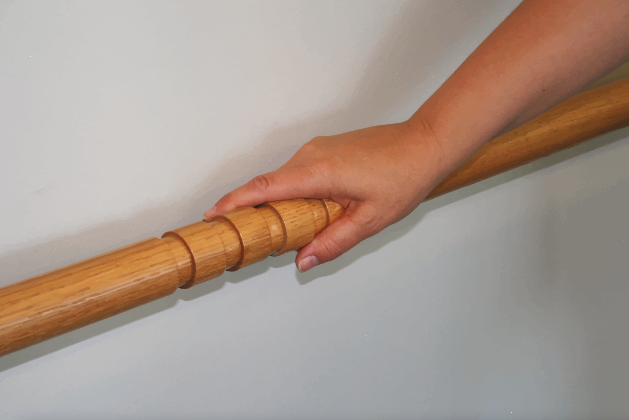
“Using this groove in the hand-rail as a directional device develops my confidence in wayfinding, even when I’m not accompanied by my dog.”

–Diane Bergeron, Accessible Design Expert. Diane Bergeron consulted extensively with Architect Ron Wickman when he was designing the space. Her input was invaluable.


AN ACCESSIBLE OFFICE SPACE

The architect’s essential task is to design paths and means of movement that are clearly organized and intuitively locatable. 

When I was asked to design the office space for the Premier’s Council on the Status of Persons with Disabilities in downtown Edmonton, this became my challenge. Details like the handrail had to be perfectly honed as a directional detail for staff and visitors entering the meeting rooms and offices of varying sizes, support spaces or accessible washroom, all designed to accommodate as many people as possible.

The four grooves cut into the circumference of the handrail, set at 900mm (3’-0”) above the floor along the entire privacy wall indicate the location of doorways to adjacent cubicles. The handrail detail is unique to this office space, making it necessary for users to know the purpose of the grooves as a directional device.

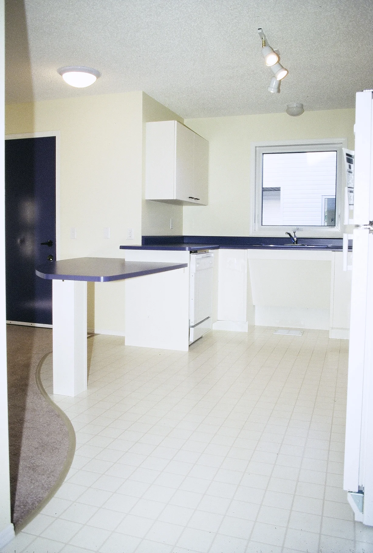
The above image is an interior view of the waiting area highlighted by the curving privacy wall.

As one enters the office space, the most immediate feature is the tremendous spaciousness. The waiting area is extensive, highlighted by a curving division wall. The wall undulates upwards from the most public to the most private spaces in the office. To the east, directly off the foyer, an accessible toilet room in a circular shape amplifies the spaciousness. Meeting rooms, offices, and cubicles are comfortably roomy; nonetheless, it is secondary to the spaciousness that surrounds them.

The elements of wayfinding design—that is how people orient themselves in a space—make the office space uniquely empowering for its users. One-and-a-half-meter-wide squares are cut into the existing carpet at points where the user would need to make a decision to change directions using squares made of Marmoleum, a greener, more sustainable variety of linoleum. The color and texture contrast serve as wayfinding cues and assist people with visual disabilities to make positive and purposeful choices in movement. For people who are blind, the squares allow them to move about without the use of a cane or a guide dog. The vocabulary provided by the color and texture of materials, by decorative elements of walls and ceilings and by light, sounds and smells, is almost infinite.

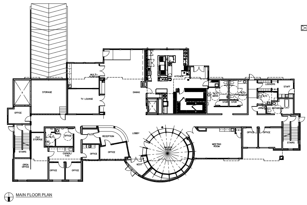
This image is a floor plan of the office space for the Premier’s Council on the Status of Persons with Disabilities, located on the eleventh floor of the HSBC Building in downtown Edmonton. The orange and yellow Marmoleum squares act as color and textural contrast indicators in directional wayfinding, indicating the need for the person to change direction.

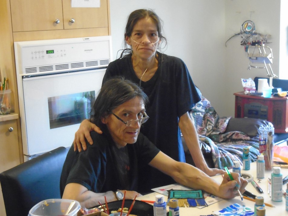
The image beside shows Diane Bergeron and her guide dog standing outside a cubicle space utilizing another directional device carved into the wooden handrail. I was confident in the task, but my friend Diane Bergeron gave me great insight into the way persons with visual limitations orient themselves in space and move around it, including enhancing the maximization of echolocation. Thanks to her intelligent questions, the office space, designed to accommodate
staff members like her who are blind or use wheelchairs, functions well. 

In the world of design, many architects focus an inordinate amount of energy on the visual beauty of a detail. Completed with great effect it may indeed be very beautiful but its functionality matters not at all to the designer, his peers and the general public. An accessible design detail, however, must not only have beauty, it must also work functionally for all users. When an accessible design detail is completely wrong, it will indeed not only look dumb to everyone, it can also confuse users for whom it was intended.

An astute observer and a practical woman, Diane Bergeron was a tremendous asset to me while I worked on this project. She gave me great
insight into the way persons with visual limitations orient themselves in space and move around in it. She also often offered practical solutions to enhance echolocation as this capability is known. During design meetings, I had to be very detailed in my verbal descriptions about the office layout to convey my intentions, a practice which greatly benefitted everyone’s understanding of my design process and solutions.

The mandate given me was to design the new Premier’s Council space as the best example of good design possible, not simply focusing on good accessible design. This moves the focus away from just designing to accommodate persons with disabilities toward designing to accommodate everyone. Through the strategic placement of the functions, activities and elements that make up a building, and through the manipulation of space, light, color, texture and materials, architecture helps allow all users to make positive and purposeful choices for independent movement. It’s a given. Accessible Design then, is not just considering the individual pieces that make up the whole, but rather it is recognizing that the collection of pieces are all deeply interdependent.

The accessible toilet room that I designed is a focal feature in the overall design of the office space. Glass blocks allow for natural light to enter the washroom. The door’s kickplate is organically shaped, utilizing the same Marmoleum that is used in the flooring contrast pieces. Color contrast is also used inside the toilet room where the floor meets the wall. This allows people with low vision to identify the boundaries of the space. Ultimately, this space is a positive blend of function and beauty. What makes the space so beautiful is its functionality.


Architecture helps allow all users to make positive and purposeful choices for independent movement.

Faid House

“In no way were the family’s aesthetics compromised by the accessible features.”

–Ron Wickman


AGING IN PLACE

022-FAID EDITED.jpg

The above image shows the front of the three-story FAID home facing west toward the street. 

Empty-nesters Peter and Alison Faid commissioned me to design their home in 2006, when they purchased a 33 ft. by 140 ft. lot in the same neighborhood they had lived in for 25 years. They wanted their new home to allow them to age in place. Experience had taught them the importance of an accessible home, making the principles of visitability important. Besides, Peter had a heart condition, which could make stairs a problem in the future. Not only did they want their home to be accessible but they wanted its beauty to reflect their style and taste. The three-level home sits on a narrow lot, and comes with an attached car garage in front and a walkout basement.

In keeping with the principles of visitability, they have no stairs at the front entrance of their home and minimal thresholds for all exterior doors, with level entry to the garage. The home is located in an inner-city community affording them better access to a greater host of neighborhood amenities. Inner-city development promotes a safer and a more positive and efficiently run city. One of the biggest myths about accessible design is that such structures will be ugly and costly utilitarian. This simply is not true.

The three key accessible design strategies in the Faid home was to incorporate a no-step entrance at the front door, an elevator to make vertical access accessible, and wet room designs for the bathroom areas. 

012-FAID.JPG

This photograph represents the back perspective of the house, including a level deck and a walkout basement. 

“We planned this house as an empty nester / retirement home – the trend these days is called aging in place. That’s why we have wide halls, an entrance at grade, lever handles, better lighting – and an elevator! We feel really lucky to be living in such a great place.”

–Alison & Peter Faid


Screen Shot 2017-10-04 at 1.22.51 PM.png

The image beside shows the elevator, which provides easy access to all three levels of the house, with its door open, stopped on the main floor.

At least five feet of space in front of the elevator enables maneuverability for users in wheelchairs. The home’s stairway wraps around the elevator. Designed as short runs of five to six steps each, with sturdy handrails and step lights, the stairway provides for safe vertical travel by foot. The elevator as part of all of the accessible design features integrated into the house design made moving into the home simpler. To satisfy users with varying disabilities in the best way possible, the house features wider doorways (at least 36 inches wide) and decorative rocker-style light switches which can be operated with a wrist or elbow. Extra insulation in all walls provides better acoustics; color and textural contrast is provided to assist in wayfinding for persons with visual and cognitive difficulties. 

Although neither of us need the elevator to date, the elevator is great for moving things like groceries up to the second level or the basement. It was also extremely helpful when moving into the home because the movers were able to put all the appliances in the elevator, rather than carrying them up the stairs.”

–Peter Faid

FAID 2.jpg

The above floor plan illustrates the main living area, found on the top level and accessible to people of varying disabilities via the elevator.

In keeping with the principles of visitability, the hallway is at least 42 inches wide with a high brick red curved ceiling connecting the living / dining room and the kitchen. Red accents including pillows gathered in the Faids travels to Cambodia and Turkey integrate the space and provide punch. A bank of bright windows faces east and frames the gas fireplace. The living / dining room and kitchen are painted a soft sage green. 

The above floor plan lays out the grade-level first floor of the house into which all guests enter through the front door. The broad entranceway incorporates a vestibule containing a bench on which visitors can sit while donning or doffing shoes. This level also contains Alison’s office (painted a pale mauve) and the master bedroom. Off the master bedroom is a bathroom (one of two full baths and one half bath) that serves as a symbol of the home’s combination of form and function. The clear box shower of glass and ceramic tiles the color of mottled concrete is large. On one wall of the shower is a stylish grab bar. A low stool, made out of Asian teak, sits outside the shower. Because its wood can be exposed to water without damage, it can be pulled inside if anybody wants or needs to sit down while bathing. 

The above floor plan illustrates the lower level of the home containing Peter’s office, a suite with a bathroom and bedroom and the laundry room. As part of their strategy to age in place, the Faids wanted a lower-level suite, which could accommodate a live-in caregiver, with a separate entrance that opens out to the backyard. A counter with a sink, microwave, and small fridge, with space to accommodate a cooktop, provides independence for guests, visiting family or live-in caregivers. Triple glazed windows and high R-value insulation incorporate energy efficiency. An on-demand hot water system saves money and energy, as does the high efficiency furnace. 

This image shows the third floor living room looking out onto Edmonton’s beautiful river valley facing east. 

many people as possible. As architects, we are trained to find creative solutions to design problems. Making universal design beautiful is our challenge. Architects and designers have no reason to fear their design options will be limited by accessibility. Instead, inclusive design contributes value and meaning to any design methodology.

We have been talking about accessible housing for almost fifty years, but I think our aging population will be what finally pushes us to get it done. Baby Boomers, like the Faids, actually have the money and the influence to make things happen. They will not just accept that nursing homes are part of their future. They will demand something different.

Accessible design need not compromise a designer’s approach to design but rather becomes an element in every designer’s approach. The Faids home was guided by principles of site, light, and views. Equally important was visitability, adaptability, and accessibility. Nor is sustainability and energy efficiency left out of consideration. With flexible spaces and accessible designed details, the Faids home is a good fit over the family’s lifecycle, which can later appeal to a wider range of potential buyers, when the time is right to sell. Even the second floor deck, overlooking the leafy Mill Creek Ravine has proven accessible by users in wheelchairs. 

Core Association

“Designing with positive wayfinding in mind helps everyone feel safe and comfortable.”

–Ron Wickman


HOUSING WITH HEART

The above image shows an exterior view of the building. The design takes advantage of the south-facing valley views. Large skylights bring natural southern light into the heart of the building. The exterior form and finishing is inspired by modern and rural architecture. The use of common local materials such as corrugated metal and stucco helps to link the building to its regional context. 

In early 2011, Clients Ongoing Rehabilitation and Equality (CORE) Association hired me to develop plans for a new innovative home that would allow individuals to age in place by remaining in the community with familiar caregivers, ensuring a quality of life with the care they need and deserve. This project involved the conversion of a four-classroom school and gymnasium into an eight-bedroom residential home for people with developmental disabilities and a concurrent diagnosis of dementia or Alzheimer’s disease. 

In 1960, CORE had built the George P. Vanier School in Medicine Hat, Alberta for 15 students. In the early 1980s, the school became part of the Medicine Hat School District and five years later, it was closed. Work began on its residence conversion in 2011. The transformation of the George P. Vanier School into a home for long-term care is based on an age – in - place care - support model providing the necessary resources for those living with disabilities and complex needs. The entire facility design is based on accessible living allowing for maximum mobility and independence. 

Residents of the new home were born with some form of cognitive limitation, and have later also developed some form of dementia. The design facilitates care for residents with dementia, accommodating their special needs such as safety, sufficient illumination, choice of movement, and a clearly legible circulation system. 

The above drawing shows an interior view of the living and kitchen area of the CORE Care Home. The circulation systems provide for clear composition of spaces that can be easily perceived. Our attempt was to create positive and purposeful relationships between indoors and outdoors, light and dark areas, for loud and peaceful rooms, and allow residents to be on their own or a part of the larger community. 

The home was designed to provide residents a clear choice for movement, and to respect their wishes for self-control. The challenge is to design a safe environment, but not in a way that residents feel that their movement is being controlled or restricted. Persons with dementia can become agitated when they feel that others control their movement. As most people age they feel a need for a safe and secure environment, especially those persons with dementia. The environment was designed to make finding one’s way around easy and to provide a sense of security, without using schematic signage and wayfinding systems typically seen in hospitals.

The design attempts to address and cater to the needs of the residents and staff, not the conditions with which the residents live.

The one-story building now houses eight residents with two respite bedrooms available for use by the community. All ten residences incorporate their own fully accessible bathroom. The gymnasium was converted into a kitchen and dining area. Other functions in the building include a Crafts Room, Laundry Room, Therapy Tub Room, Public Washroom, and Office Space. To make all of this work, additions were completed to the North, West and East sides of the building. 

gwen.jpg

The image beside shows an interior view of a hallway space. The use of color and textural contrast can be very powerful, Herein, color and textural contrast is kept to a minimum to minimize too much visual complexity. The lesson here is to minimize visual stimulation and provide instead more purposeful visual stimulation. 

Indoor spaces have been designed to be communal and to make choice for movement as easy as possible. Persons with advanced stage dementia tend to walk about in public areas, not in private. Chance contact with others is deemed as a positive thing.

The main design feature of the project is the walk-about. The circular layout of the hallway allows individuals to walk around the whole building without getting lost. Large skylight structures were added to the roof to help bring natural light into the middle of the building and the walk-about. Color and texture contrast is used strategically to better help residents, staff, and visitors in their wayfinding.

The kitchen and living area has been designed to be the center of daily life for the residents and their families and staff. This space is the focus of daily routines and communal life.

All resident bathrooms are designed and constructed as wetrooms. All shower areas are wheelchair accessible and large enough to accommodate a resident and an attendant. This is Accessible Architecture where everyone benefits. 

The above drawing shows the landscape plan of CORE Care Home. The design of the outdoor space at the CORE Care Home offers the same safe, simple, and easy choice for movement. Easy access to the garden spaces, with familiar native planting to trigger positive memories and free movement allows residents to savor the pleasure of being outside. The outside space was designed to provide sensory stimulation that is meaningful, safe and understandable, as well as to provide for pleasure, socializing, and activity. With the addition of areas of sun and shade, seating and tables, the outdoor environment helps reduce the residents’ behaviors that challenge and stress. Obviously, this makes life easier for the caregivers as well. 

The image beside shows a portion of the exterior south facing walk - about. When the home environment is designed to be beautiful, everyone benefits. Residents, family, staff, and visitors can feel part of the environment and also feel valued. This building owned by CORE has now served as a school and a care home. It is located in a meaningful location, which plays a major role in the community. In time, when our aging population decreases, the building could easily be converted back into a school. 

My House

“The home bridges affordability and ecological design and construction, while highlighting green-building materials and methods that are easy to obtain and simple to use.”

–Ron Wickman


MY REWARD!

house model.jpg

The above image is a scale model of our new family home viewed from the south. Like most architects, the design and re-design of our family home was de rigueur. In 2000, we completed a second-story addition to our 1960s bungalow. The home modifications were designed primarily to accommodate the growing needs of our family of five. Accessibility and sustainability were also important architectural concerns. The sustainable features include passive solar design; a well insulated building envelope, low-flow toilets, and a green roof. To make the home more accessible, all public spaces are clustered on the ground floor; we poured a sloping sidewalk at the front entrance. 

front drive view.jpg

The above image shows the front view of our new two-story home, facing east.

The home is located in a quiet late sixties south-side suburb along a beautiful street lined with elm trees. The existing 1400 SF bungalow doubled in size, with the renovated home providing more room for the family and for my home office. The addition to the home goes up rather than out. Located at the intersection of two back lanes, the home is sited on an east-west axis. Its south side faces one of the two lanes with better access to the sun. The home location is ideal with the added advantage of being located in a mature neighborhood close to a variety of amenities and public transportation. 

WICKMAN - MAIN.jpg

The above floor plan drawing illustrates the main floor of the home, wherein all the public spaces of the house are clustered, including my home office.

The office has a separate entrance at the front of the house, which can easily be blocked off from, or opened up to the rest of the living space, depending on the family’s needs. In the future, the space could be used as an in-law suite, or for an adult child still living at home. The crisp lines of this design are clearly inspired by the work of the early modernists with the house acting as a backdrop to human activities. A variety of box forms, devoid of any unnecessary embellishments, articulate the various functions of the building. Like later modernists, such as Alvar Aalto, the house utilizes a more human scale and warmer local building materials. Indeed, this house renovation looks to the past for inspiration, although it is more focused on today’s social and political conditions, and on our need to respect our fragile environment. 

WICKMAN- SECOND.jpg

The above floor plan illustrates the second floor of the home.

The design is straightforward with the house functions clearly divided into their constituent parts and the building’s form derived from the order of the interior and exterior spaces. A northern, two-story block contains the private spaces with four bedrooms on the second floor, and a home office, a sitting room, and a garage on the main floor. A south facing one-story block contains the public spaces on the main floor, topped off by a roof deck. A distinct third block, built at a height between the two other blocks, weaves the private and public realms together. This in-between space contains two levels of circulation complete with sitting areas, and serves to provide a positive connection between the public and private functions. Architects should spend more design time on these in-between spaces, since they are critical in imbuing meaning to the various functions in a single-family dwelling and in an entire city. Carefully constructed outdoor spaces also link the home to the rest of the community. The design of these outdoor rooms—the roof deck, front courtyard, and back play area—are every bit as important as the indoor spaces providing variety and personalization to this design. 

Staircase.jpg

The image of the stairs leading to the second floor utilizes color and textural contrast to help persons with low vision in their wayfinding. The stairs are finished in dark slate tile with light colored maple nosings. The high contrast makes it very easy for users to identify each individual stair. My design decisions—to be as accessible as possible— are based on maximizing the experiences of end users. There are no steps at the front door, allowing persons in wheelchairs to access the main floor independently. A residential elevator would be required to make the second floor wheelchair accessible. The home also bridges affordability and ecological design and construction, while highlighting green-building materials and methods that are easy to obtain and simple to use. 

 
Approach1.jpg

The image beside is a rendering by Jared Schmidts of my father moving up the sloping sidewalk to the front door of my house, from my adult children’s book Accessible Architecture: A Visit from Pops. “Buildings should never be designed simply as sculpted objects to be viewed; the design aims to be usable by as many people as possible. When architects design buildings that cannot accommodate people with disabilities and others, the strength of their design is compromised. Accessible architecture is not about limiting design options. It is about bringing value and meaning to design.” 

Affordable Housing Demonstration Project

“This concept is a winner. It has a simple yet livable design and makes innovative use of the site... Overall, this design sets a good precedent.”

–The Jury


OFFERING GREATER CHOICE IN HOUSING

AFFORDABLE HOUSING SITE.jpg

The above color-rendered site plan drawing highlights the landscaping and color contrast around and between buildings. The project houses an inner south-facing outdoor courtyard space measuring approximately 24’-0” by 24’-0” onto which each dwelling looks. Everyone is free to utilize this space, a move designed to promote social interaction, bringing people together rather than keeping them apart. Local architects and homebuilders were invited to design affordable, innovative housing for a city-owned lot at Baldwin at 12673 – 72 Street, allowing more flexible land use. At least one unit had to be suitable for families with children.

Eight local teams of architects, designers, and builders submitted proposals that included two or three units of housing on the site. The five-person jury considered each entry’s affordability, effective design, livability, neighbourhood fit, and innovation.

Winner of The Affordable Housing Demonstration Project in 1994, the tri-plex was the result of an open competition, initiated by the City of Edmonton Planning and Development and the Innovative Housing Committee. Its goal was to provide affordable and innovative duplex and triplex solutions for an inner city lot 35’-0” wide by 120’-0” long. Completed in the fall of 1995, it is still fully occupied.

1.jpg

The above drawing identifies the main floor plan complete with the ground floor of the two-story home and the ground floor accessible dwelling. The resident of the accessible dwelling can visit the other home from the back door facing the courtyard where there is a no-step entrance.

A simple flow-through circulation pattern is enabled with the absence of hall in the plan. Efficient use of space is notable in this design, as an outcome of lived experience. Designing to accommodate wheelchairs, which need more turnaround space, challenges architects to produce innovative solutions, which may be just outside the realm of what is considered the norm.

The project was designed to accomplish several important goals not usually addressed in Edmonton’s housing market. It had to accommodate low-income families, single parents, shared accommodations, seniors, and individuals with disabilities. Its flexibility allows one family to occupy both buildings, encouraging multi-generational housing: extended households, which include grandparents, young families with children or young adults living independently with disabilities. Alternatively, two families can each occupy a building, or three separate families can inhabit each unit.

2.jpg

The above drawing identifies the second floor plan of the two buildings. With limited circulation space within the units – the smaller unit is 24’-0”by 24’-0” or 576 sq. ft. and the two-story unit is 24’-0” by 32’-0” or 768 sq. ft. – allows for critical larger closet and storage space.

The integration of a courtyard into the design promotes social interaction rather than isolation. With an aging population and reduced institutional care for the elderly, the idea of an accessible granny suite like this project offers is timely.

adhp.jpg

The above image shows the integration of this housing project into its existing neighborhood.

It can be seen as an illustration of successful community infill, encouraging inner - city communities, which are often deserted as urban development continues in the suburbs. In my housing models, I try to provide for both privacy and socialization. The future of accessible design in the community is accessible community design: creating communities that are more accessible for everyone. This design fits into the existing streetscape, yet at the same time sets the tone for what future development could look like.

Features like on-grade access, open floor plans, a lower kitchen counter, lever door handles, grab bars, accordion closet doors, and adjustable rod and shelf heights all help a variety of individuals. The strategic uses of color and contrast plus changes in texture of ground and wall surfaces serve as visual and tactile cues for those persons with visual and cognitive limitations.

As architect Bjarke Ingels (Yes is More) wrote in a recent interview, “The task of a city is a practical one: to accommodate many people from all kinds of different backgrounds, age groups, social groups, economic capacities, genders, religions, and so on. It has to enable them to co-habit a limited amount of space successfully, in a way that maximizes the possibilities for each individual, without limiting the possibilities for all the others.”

This project designed with sustainability, adaptability, and flexibility makes it suitable housing for seniors and for people with disabilities. Their maximization of space, incorporation of light and proximity to the amenities typical of inner-city housing enables the residents to age in place, a growing concern among the number of seniors among us. Community, rather than isolation, is an essential ingredient of their continued vigor and mental health, despite their abilities.

The image above shows the street facing home complete with the address sign of high contrast white and black lettering.

The image above shows the street facing home complete with the address sign of high contrast white and black lettering.

The image above shows the kitchen area of the ground level accessible dwelling. Most of the counter height is the standard 3’-0” from the floor. A lower counter, which is open underneath extends into the living space. The counter can serve as a work…

The image above shows the kitchen area of the ground level accessible dwelling. Most of the counter height is the standard 3’-0” from the floor. A lower counter, which is open underneath extends into the living space. The counter can serve as a workspace and eating area for someone sitting in a wheelchair. The sink is open underneath for easy wheelchair access.

Ambrose Place

A HEALING HOME

In 2006, NiGiNan Housing Ventures, a not-for-profit group hired me to design a housing project for persons who are currently homeless. Ambrose Place primarily serves homeless individuals and couples of Aboriginal descent: chronic substance abusers who cannot be housed within existing facilities. Some may have been barred from existing facilities, while others may feel that the existing facilities do not meet their requirements and thus do not use them. Many of the individuals suffer from concurrent mental health issues such as dual addictions. The housing focuses upon improving the quality of the individual’s life, health, and well-being, looking beyond the labels of addictions or disability to look at the whole person including their history, culture, mental, physical, and spiritual needs. The role of the practitioner is to educate the person on options and consequences, thus enabling the individual to improve their quality of life, health, and wellbeing through gradual non-judgmental means. Ambrose Place meets these standards.

The architecture adheres to the principles of American sculptor Davis Best of Burning Man fame. “…it’s more important who goes inside…A building itself should never be more important than the people.” The beauty of this project is not just based on its visual aspects, but in its ability to transform people’s lives. There is tremendous beauty in living with grace, safety, and confidence.

The design of Ambrose Place provides an environment that facilitates individual growth and development and enhances the individual’s self-esteem and capacity for independent living. Residents need to have a sense of control over their own lives. The project transformed six raw, vacant lots on the south side of 106th Avenue between 96th and 97th Streets in downtown Edmonton. Through its enhancement of the built environment with social housing that enhances the quality of life of its residents, Ambrose Place reaps both social and economic benefits for the City of Edmonton. 

The above image shows Ambrose Place within its urban context. Both within Ambrose Place and the community where it is located, accessibility is a guiding principle. The building is strategically located in the inner city close to many important amenities, which comprise part of the individual residents’ daily lives. Easy access to health-care services - located only a half block to the east - a commercial shopping street - located only a block to the west contribute to the residents’ quality of life. The downtown police station, just north of Ambrose Place provides safety for all its residents. The building increases the density in the community by maximizing the building pocket size and allowable height at four storeys, a height which harmonizes with its surrounding community. It is designed at a scale to fit within its urban context. 

IMG_9094.jpg

The image beside shows an exterior view of Ambrose Place. The modulated roofline and walls with projecting bay windows provide depth and complexity to the building form. The four singular pieces of the building are different colors—red, white, blue, and yellow—making each piece more identifiable. The natural materials used are located close to where individuals can touch and smell. The landscape design incorporates the four elements of Earth, Fire, Water, and Medicine, elements central to the First Nations’ culture and intended to bring additional healing and relevance to its inhabitants. 

FrontEntrance.png

This is the main entrance. The new facility consists of four floors, plus an underground parking garage. The top floors contain 42 dwellings: 36 bachelor suites and 6 two-bedroom suites, The main floor consists of shared spaces that include dining room, exercise and tub room, TV and recreation areas, a Quiet Room, staff offices, staff laundry and more. A circular Smudging Hut located in the central lobby focuses as both a physical and spiritual reference point, inside and outside, for residents, staff, and visitors including the neighboring community. As the heart of the building, the Smudging Hut is central to the design concept and is the most decorated and detailed part of the building. 

AMBROSE MAIN.jpg

The above plan shows the main floor of Ambrose Place, which houses all the amenity services including the smudge room. 

AMBROSE 2,3,4.jpg

The above plan shows the second, third, and fourth floors of Ambrose Place which houses the 42 living units, all with their own kitchens and bathrooms. 

The above images show an exterior view of the Smudging Hut and Landscaping. 

The above images show an exterior view of the Smudging Hut and Landscaping. 

The above image shows an interior view of the Smudging Hut. 

The above image shows an interior view of the Smudging Hut. 

Screen Shot 2017-09-12 at 5.57.44 PM.png

The above image shows two views of the bathrooms at Ambrose Place. All 42 suites house bathrooms designed as wet rooms to allow for curbless wheelchair accessible showers. 

Screen Shot 2017-09-12 at 5.59.22 PM.png

The above image shows an interior view of an adaptable kitchen. At Ambrose Place, we designed 10 adjustable kitchens instead of the required five. We designed an L-shaped counter, which moves up and down to accommodate both residents in wheelchairs and those who have mobility; it is open underneath. For a resident in a wheelchair, he / she can slide a pot along the counter from the sink to the cooktop and back. The upper cabinets have also been constructed to move up and down. This has all been accomplished with nuts, bolts and screws. Extra building costs were minimal. 

Accessible features at Ambrose Place exceed the Barrier Free Design Requirements located in the Alberta Building Code include, simply put, wheelchair accessibility is addressed outside and inside all four levels of the building.. The Alberta Building Code requires five adaptable suites. The provision of these dwelling units needs further classification since it is difficult to anticipate individual needs. Ten suites house adaptable kitchens. Color and texture contrast is used to help all users in their wayfinding.

Persons who are blind or deaf require a common electric circuit interconnecting all rooms and with the potential for connection to the fire alarm, intrusion alarm, intercom and phone system. To ensure that Ambrose Place met these requirements, the design team met with potential residents to ensure that the design met his needs. 

Ambrose Place has changed people’s lives. The four images above feature Ambrose, after whom the building has been named. He died on the streets living as a homeless person. Piano man Ryan was a YouTube sensation playing a piano in an outdoor public space in Edmonton. In the past, he had difficulty remaining in housing due to his addiction and mental health concerns. Ambrose Place has become home for him. Ronalda and Brad live as a couple at Ambrose Place. Ronalda has a chronic respiratory system; Brad has been diagnosed with a terminal disease and has use of only one leg. Homeless for a long time, they stayed in shelters, hotels, and with friends until 2014 when they moved to Ambrose Place. Brad had his first Art Show in February 2016. Valerie was diagnosed and given a life expectancy of two months, after being homeless for the last 20 years with couch surfing and shelters. At Ambrose Place since 2014, she is thriving. Ambrose Place has special meaning to myself, as my father came to Edmonton from Thunder Bay as a young man, and lived homeless for a short period of time. Finding a safe home meant everything to him.